Read metals, colors, furs, and contrast through worked designs and dated records, including buff, copper, Rose, Bleu Céleste, and red ochre.
The shorter presentation introduces the unit. Continue here for the expanded reading, source notes, and documentary workshop.
After this lesson, you should be able to…
- Name the principal tinctures and distinguish a specified tincture from its material realization.
- Trace immediate backgrounds, divisions, edging, and counterchanging before applying a contrast convention.
- Compare documented uses of buff, copper, and other additional tinctures without imposing one universal classification.
- Distinguish a named tincture, natural coloration, and an institutional production specification.
- Read conventional hatching while explaining what a monochrome witness can establish.
- Build a source-specific tincture study with an explicit corpus, claim trail, and developed interpretation.
✦ The teaching example
Azure, on a fess Or three martlets Gules.
Original teaching illustration · not a grant or register entry.Expanded teaching draft; specialist review pending. Updated . Sources and constructed examples are identified in the text.
What a color name actually tells us
Suppose we encounter three shields that appear to have pale brown backgrounds. One is a photograph of a leather object, one is a modern military illustration whose description specifies Buff, and one is a reproduction of arms whose written description begins with Copper. The pictures may look similar on a particular screen. Nevertheless, we have three different kinds of evidence. The leather tells us about an object’s material. The military description names a tincture within an institutional practice. The third description specifies a metal outside the familiar introductory pair of gold and silver. If we record all three as “light brown,” we have preserved an impression while deleting the distinctions that make the objects intelligible.
This chapter develops a way to keep those distinctions in view. Begin with the principal palette, then examine how tinctures relate within a composition. After that, follow the less familiar terms into dated records: Buff in U.S. Army and Canadian use, Copper in Canadian arms, Rose and Bleu Céleste in Canadian emblems, and red ochre in South Africa’s national arms. Each encounter asks a slightly different question. Does the term name a conventional category, a particular shade, an actual substance, or an instruction for producing an object? Does an institution expressly classify it, or are we inferring its role from the design?
There are consequently three tasks to master. We must be able to read a specification, draw an intelligible realization, and investigate the relationship between a description and its surviving witnesses. A student can succeed at the first while producing an unreadable picture. An artist can succeed at the second while inventing tinctures absent from the evidence. A researcher can accurately describe the photograph while misunderstanding what its colors establish. The useful skill is knowing which task we are performing and what would justify the next inference.
The shorter guided lecture supplies a first encounter with the vocabulary. Here, the argument proceeds from that vocabulary into its limits and applications. The documentary cases are linked to records readers can check; the teaching designs are explicitly constructed examples.
A limited palette with an important distinction
Heraldic color is not an exercise in finding the exact shade used by a printer. It is a vocabulary for identifying a design. In the English terminology used here, the principal tinctures are Or, Argent, Gules, Azure, Sable, Vert, and Purpure. Gold or yellow and silver or white are called metals; the remaining five are colors. These categories are conventional, not a claim that yellow paint is made of gold.1
| Tincture | Everyday description | Category in this introduction |
|---|---|---|
| Or | Gold or yellow | Metal |
| Argent | Silver or white | Metal |
| Gules | Red | Color |
| Azure | Blue | Color |
| Sable | Black | Color |
| Vert | Green | Color |
| Purpure | Purple | Color |
A historical source may use different spelling, a different linguistic vocabulary, or a larger palette. Preserve the actual wording before normalizing it. A database field called “red” may be convenient for searching, but it should not erase whether a document says Gules, gueules, or something else. Our translation laboratory exists because vocabulary belongs to a language and a source, not merely to a swatch.
We also need to distinguish the tincture specified for the arms from the material used to depict it. A gold charge can be painted yellow, rendered with metallic leaf, or indicated in an uncolored drawing. Those are different realizations of a category. Conversely, the brown appearance of tarnished or damaged material does not automatically establish a brown tincture. Appearance and specification must be compared, not collapsed.
The useful distinction is between identity and realization. If an artist replaces a yellow-painted charge with gold leaf while preserving Or, the medium has changed. If the artist changes Or to Argent, the specified tincture has changed. Those two operations may both make the picture brighter, but they are different changes to the design. Our description must tell a later reader which operation occurred; a comment such as “the new version is lighter” cannot do that work.
The familiar seven are a starting vocabulary, not an inventory of every color word in every armorial record. Canada’s public guidance itself acknowledges exceptional additional colors.2 A reader who learns the seven and then silently forces every unfamiliar term into one of them will introduce errors precisely where the evidence is most interesting. Retaining an unfamiliar word costs little. Replacing it with a familiar one can destroy the question we needed to investigate.
A tincture is not a universal paint specification
The College of Arms answers the Pantone question directly: its guidance allows the artist to choose shades within recognizable tincture categories, while cautioning against a blue becoming too light or a red drifting toward other colors.3 Canadian military terminology likewise describes the traditional seven as conceptual colors whose shades can vary.4 These statements concern armorial identification. They do not promise that every manufacturer, institution, or graphic identity manual permits an unrestricted range of paint and thread.
An institution can preserve a broad heraldic category while specifying a narrow production target for its own objects. This is easy to understand with a hypothetical commission. A blazon might call for Azure; the embroidery order might then identify a particular blue thread, backing fabric, and finished size. Another artist could paint the arms with a different recognizable blue without following that embroidery order. To decide whether either version meets its purpose, we need the appropriate specification. The blazon settles one question, and the manufacturing instructions settle another.
U.S. Army branch records make the distinction particularly visible. The Logistics Branch page supplies separate cloth, yarn, and Pantone identifiers for Soldier Red and Bronze.5 Such identifiers help coordinate manufactured items across materials. They belong to a documented institutional application; importing one of them into a universal table of heraldic colors would give a local standard a reach its source does not claim.
This also explains why sampling a pixel from an official illustration is an unreliable way to recover a production standard. The pixel belongs to that digital file. Its value may depend on how the original was photographed, scanned, edited, or exported. Even if we reproduce the value exactly, we have reproduced the file’s number rather than demonstrated its relation to paint or thread. Record the file and its context when they are the evidence. Use an explicit technical specification when the question concerns production.
When comparing two depictions, start with the strongest description available and ask what range of variation it permits. A darker blue can be a different realization of Azure. A source that separately specifies Azure and Bleu Céleste gives us a reason to retain two categories. The distinction comes from the documentary setting, rather than from a private threshold at which we decide that one pixel has become sufficiently pale to deserve a new name.
What the contrast convention asks
The familiar rule discourages placing a metal on a metal or a color on a color. A gold charge on blue provides a conventional metal-on-color combination. A red charge on blue creates a color-on-color combination. The point of the introductory exercise is to examine the relationship of a charge to what immediately lies beneath it.2
This is why “never put two colors next to each other” is an unreliable summary. Beside and on are different relationships. A divided field can place two tinctures alongside one another. A charge lies on a field or on another charge. A border can meet more than one area. Before diagnosing a problem, draw the layers and identify the adjacency you actually mean.
Think of the rule as a first test rather than a complete analysis of a design. A composition can use conventional categories and still be hard to recognize because its figures are too small, their outlines merge, or the artist chose a very pale yellow against white. You can also observe historical departures from a conventional rule without pretending the object must therefore be fake. Describe the departure, verify the source, and investigate its context.
The Canadian guide expresses a contemporary institutional formulation. Fox-Davies discusses a broader historical repertoire, including divided fields and furs.6 Neither source licenses a computer program to pronounce on every historical coat of arms. An automatic warning is a prompt for human inspection, particularly when the design contains furs, counterchanging, proper charges, or complex marshalling.
Follow the layers before declaring an exception
We can make the elementary contrast test more precise by treating a composition as a set of relationships. For each placed figure, identify its tincture and the surface immediately beneath it. Classify those tinctures within the convention being applied. Then ask whether the categories contrast. This order matters: deciding that the entire shield “contains too much red” tells us little about where the actual overlap occurs.
Constructed teaching blazon: Azure, on a fess Or three mullets Gules. The fess lies on the blue field, and the red mullets lie on the gold fess. A comparison of the mullets to the field skips the intermediate surface. A simple checklist can therefore give a false warning if it stores only the colors present and loses the relationships among the elements. The same weakness affects an enthusiastic human with a highlighter. Having found red and blue in one picture, we have not yet found red on blue.

Now change the fess to Gules while retaining the red mullets. The fess has a color-on-color relationship with the field, while the mullets have an identical-tincture relationship with the fess. These are distinguishable problems. A blue field and a red band may remain visually separable in one rendering while departing from the elementary convention. A red mullet on an equally red band may have no visible boundary at all. Calling both simply “bad contrast” conceals the different work needed to explain them.
An ordinary can also have a specified narrow edging, called fimbriation. In a constructed design with a blue fess edged white on a red field, the white separates the blue band from the red background. That edge belongs to the specification. It is different from a thin black contour an illustrator adds around everything. The Quartermaster School description provides an actual institutional encounter with a bend edged Argent, although its complete design also contains natural-colored objects.7 We should inspect what the edging separates in that particular composition rather than turn its presence into a blanket cure for every possible conflict.
A divided field adds another complication: a charge can have more than one immediate background. Suppose a gold roundel lies across a field divided vertically into silver and blue. It has a metal-on-metal relationship on one side and a metal-on-color relationship on the other. A program that samples only the center can miss half the relationship. A human audit should report both portions, then consult the relevant practice before giving a general verdict on the design. The division itself is a shared boundary, not one tincture placed on top of another.
Counterchanging solves a different kind of descriptive problem. In Per pale Argent and Azure, a roundel counterchanged, the portion over silver is blue and the portion over blue is silver. The charge retains one circular shape while changing tincture at the boundary. Its specification describes a relationship to the divided field, rather than a single solid fill. This is why the layer audit must be capable of identifying portions of a figure. The convenient database assumption “one charge, one color” fails before we have reached anything especially exotic.
Marshalling can place independent armorial designs beside one another in a larger shield. The resulting boundaries require a different inquiry from the layering inside each component. We must first establish which designs are being combined, then examine their internal specifications. A rule checker that compares every quarter with every neighboring quarter will mistake the structure it is supposed to analyze. The marshalling chapter develops the documentary consequences of combining designs; our task here is to avoid losing those distinctions in a color audit.
The practical conclusion is to locate the relationship before deciding how to interpret it. Divisions, patterned grounds, fimbriation, and counterchanging do not form one undifferentiated bag of exceptions. They change different parts of the model. Once we can say what the model leaves out, we can improve the analysis instead of adding another unexplained item to a list.
Conventional contrast and actual legibility
The metal/color distinction is a categorical convention. A modern visual test asks how a particular realization behaves under particular viewing conditions. These inquiries can reinforce one another, but they cannot be substituted without explanation. A pale yellow against a white ground may be hard to separate. A small gold charge against a very light blue may also lose definition. Describing either combination requires attention to its actual rendering, not merely the names of the tinctures.
For an original teaching design, inspect the silhouette at its intended size, then reduce it until its smallest necessary feature becomes difficult to distinguish. This identifies the point at which the rendering stops carrying the information we need. If three charges merge into one blot, we have lost number and arrangement. If an animal’s feet disappear, we may have lost a diagnostic feature. Increasing the image’s color saturation cannot necessarily recover either distinction; shape and spacing participate in identification too.
A grayscale comparison removes one source of separation and can expose reliance on hue alone. It is useful as an experiment, particularly when a design will be photocopied or displayed in a monochrome interface. It cannot identify the correct tinctures, authenticate a witness, or certify the design for every viewer. Two distinct tinctures may produce similar gray values in a given conversion, while a hatching system can retain their distinction through pattern. Record which conversion and size you tested when the result matters.
The additional tinctures make these distinctions especially important. A pale buff and white can appear close in value even where an institutional record combines them. Copper may be drawn as a flat warm tone or with a metallic effect. A dark outline can improve one small rendering while doing little for another. The responsible conclusion describes the observed difficulty and the attempted remedy. It does not retrospectively rewrite a grant because our chosen thumbnail is poor.
For a website, we also need ordinary accessible interface design. Labels, explanatory text, keyboard operation, and readable contrast carry information that a colored shield alone cannot supply. A color swatch should have a name. A warning should identify the relevant relationship in words. These choices let readers inspect the argument even when they cannot distinguish our particular samples, and they stop the lesson from requiring the very perception it is supposed to explain.
Buff: a pale color with several institutional lives
Buff is interesting because the familiar seven-tincture table does not explain why it matters. The Quartermaster School’s branch information identifies buff and blue as branch colors and describes buff as a shade of tan.8 Here we have a named institutional association, rather than a claim that every tan object is heraldically Buff. An unfamiliar term becomes easier to investigate once we know which organization uses it and where to look for the relevant descriptions.
There is also an older material setting. The Royal Armouries identifies its buff coat III.1929, dated 1631–1670, as oil-tanned bovine leather.9 The National Army Museum connects the name of The Buffs with buff coats and later buff-colored uniform facings.10 These records establish European military uses of the word and color. They do not establish that Buff was a routinely specified tincture in European armorial blazons. An object name, a uniform color, and an armorial category can share a word while requiring separate evidence.
That distinction changes how we frame a comparative claim. “Buff is absent from the Old World” would be contradicted by the material and uniform records. “Buff seldom occurs as a named tincture in this dated armorial corpus” would be a claim we could test by defining the corpus and counting its descriptions. The narrower proposition may prove useful, but we have to do that work before giving it a number or extending it across Europe. A search that returns few familiar examples is a research lead, not a frequency estimate.
The U.S. Army records show why the subject deserves more than a miscellaneous-color footnote. The Quartermaster Corps regimental arms, approved on 16 June 1994 according to the Army’s historical account, use a buff field and an Azure chevron, with additional charges of several tinctures.7 The Army museum ties the field to the Corps’ identity and the blue chevron to its logistics role.11 Buff therefore participates in an institutional visual language. Replacing it with gold because gold is in the introductory table would change the specified design and discard a documented association.
There is a useful complication within that same institutional setting. The museum’s description of the 259th Quartermaster Battalion arms, approved on 29 September 1942, specifies a buff field carrying a sword and pick mattock Argent.12 We can consequently document buff combined with blue in one Army design and silver in another. Under a rigid two-category model, the first relationship would suggest a metal-like role for buff, while the second would suggest a color-like role. That is a reason to investigate the model and the institution’s practice, rather than quietly change one of the records to make the chart tidy.
We should nevertheless be precise about what these examples establish. The descriptions give us the tinctures and combinations. They do not, by themselves, constitute a formal Army-wide declaration that Buff belongs to one category in every application. An inferred role in a composition is weaker evidence than an explicit rule issued by the responsible institution. We can teach both the observed combinations and the limits of the inference without pretending that the uncertainty prevents useful analysis.
Canada supplies a particularly instructive comparison. The 15 October 2009 grant for the Correctional Service of Canada begins its badge description with “A roundel Buff” and places a gold key and torch on that roundel, with a red maple leaf over them.13 The gold-on-buff relationship supports reading buff in a color role in this design. The register entry does not supply an explicit general classification of Buff, so that conclusion should be labelled a compositional inference. Calling it an additional Canadian metal would leave the observed gold-on-buff relationship unexplained.
This is the kind of question a reference chapter should make answerable. We can distinguish the documented use of the term, the visible or described relationship, the institutional symbolism, and a proposed classification. Those are four claims with different evidential requirements. If we compress them into “Buff means tan, metal,” the resulting answer is short and portable, but unreliable as soon as another record enters the room.
Copper: a new metal can carry a local argument
The Canadian register offers a clearer case of an additional metal in the arms granted to the City of Whitehorse on 15 November 2002. Their description specifies a Copper field, an Azure wavy fess carrying an Argent paddlewheel steamboat, and a further wavy element below.14 The blue band on copper makes a different relationship from the gold charges on Canadian buff. It gives us a concrete reason to keep the two terms separate even if a particular illustration makes both appear warm and pale.
The register’s explanation connects copper to the local mining economy and its significance for First Nations. It also specifies Copper for a locomotive wheel in the crest.14 This is a stated symbolic account for these emblems, not a universal rule that copper in any arms means mining. Once the source identifies the intended connection, we can investigate how the design makes it visible. Without such a source, the same association would be an attractive hypothesis requiring evidence.
Notice what we retain by preserving Copper instead of translating it into “brown.” We retain the named tincture, its relation to the metal/color model, and the particular material invoked by the source’s symbolism. An informal color description can help a reader imagine the picture, but it cannot replace those three kinds of information. Calling Copper “Or with a reddish shade” would likewise erase the distinction the written specification makes.
The name of a substance can occur elsewhere in a blazon without being the tincture. Coppermine Herald’s badge is described as an ulu Copper; the object and its tincture occupy different grammatical roles.15 The Nisga’a Nation record, by contrast, describes a Nisga’a copper Argent: the word copper names the object while Argent specifies its heraldic appearance.16 We cannot decide the grammar by capitalization alone, especially across different editions and editorial conventions. We have to read the complete phrase.
These cases let us formulate a useful diagnostic question: Is the word telling us what the figure is, what it is made of, or how it is to be represented? A wheel Copper is not the same statement as a copper wheel proper. A photographed copper alloy wheel supplies yet another kind of observation. Confusing the three would make a catalog appear consistent at the cost of making its records wrong.
Copper also exposes a weakness in the idea that all heraldic innovation consists of drawing new charges. A practice can extend its vocabulary while retaining familiar compositional relationships. To evaluate that development, follow dated grants, institutional explanations, and actual uses. The expanded palette belongs in heraldic history because it helps us understand what communities choose to identify and how institutions accommodate those choices.
Rose, Bleu Céleste, and an intentionally expanded palette
An unfamiliar tincture can matter because the design needs to distinguish it from a familiar neighbor. The Canada Pride Citation record, registered on 20 December 2018, specifies Rose alongside Gules and Bleu Céleste alongside Azure; it also uses Tenné.17 A transcription that converts the pairs into undifferentiated red and blue removes distinctions expressly made by the source. The register links the eight-color composition to the original Pride flag and explains the citation’s commemorative and forward-looking purpose. The expanded vocabulary serves an identified symbolic design.
This is different from deciding that a faded red passage in an old manuscript must have been Rose. The modern record supplies the term. The faded manuscript supplies an appearance that requires interpretation. If we let one of those evidential settings stand in for the other, we will either flatten a deliberate modern distinction or invent an undocumented historical one. A vocabulary becomes useful when it makes us more attentive to the evidence, rather than more inventive about what it might have meant.
Bleu Céleste also appears in the 21 November 1994 grant to The Butchart Gardens Limited, where it occurs with Or in a divided field; the same arms separately specify Tibetan blue poppies proper.18 The distinction is instructive. A named sky-blue tincture and the natural coloration of a specified plant are different instructions within one record. “Both are blue” does not explain whether an artist has preserved the specification.
The Canadian examples also caution us against turning an institutional term into a universal RGB value. We can choose an illustrative sample to explain a term, but the sample does not prove the exact limits of all permissible depictions. The record’s spelling, date, institution, and place in the design should accompany the sample. When the question concerns a particular official reproduction, inspect that reproduction and any applicable technical directions rather than treating our teaching palette as the governing standard.

Red ochre and the evidence of a national specification
South Africa’s national arms make the question even more explicit. The Bureau of Heraldry’s registration notice, dated 28 April 2000, specifies red ochre for the paired San figures and the narrow border of the shield; it also names Orange in the rays above the bird.19 We encounter these terms in a formal armorial description, rather than infer them by looking for unusual colors in a photograph. They belong to the design’s documented vocabulary.
The government’s explanatory account connects the human figures to the Linton stone, a rock-art object held by the South African Museum, and describes their greeting as an expression of unity.20 That provides an iconographic connection readers can follow. It does not by itself identify the pigments in a manufactured emblem or establish the material composition of the original rock-art paint. A word associated with a pigment can become a specification for representation; the finished realization may use a different substance.
Consider the difference between three proposed statements. “The registration notice specifies red ochre” can be checked against the text. “This printed copy depicts those passages in a reddish-brown ink” requires inspection of that copy. “The copy uses an ochre pigment” requires evidence about its materials. The first statement does not establish the third, even though the same color word appears in both. This distinction becomes crucial when a catalog moves between descriptions, digital illustrations, and physical objects.
There is a textual complication too. The available text of the notice has a damaged character in its final brown-tincture term and an apparent error in the flower name. Our discussion uses the securely readable red-ochre and Orange passages; it does not silently repair the whole blazon into a purported diplomatic transcription. A critical edition would compare the Gazette witness with other authorized descriptions, state its corrections, and retain the original readings in its apparatus.
The point is broader than adding red ochre to a list. A national specification can combine inherited heraldic grammar with a particular community’s visual references. To understand that combination, follow its text, iconography, and institutional explanation separately before connecting them. The South African study places this design within its institutional setting; a fuller national chapter can pursue that history at the length the evidence warrants.
Stains, rare terms, and the danger of inherited stories
Older English manuals often discuss murrey, sanguine, and tenné under the heading of stains. Fox-Davies places murrey between red and purple, describes tenné as orange-tawny, and challenges the elaborate stories that connect these terms with humiliating abatements.6 His account is evidence of a writer disputing an inherited explanatory scheme in 1909. It is not evidence that every later institution groups the terms in exactly the same way.
The word stain therefore requires care. A historical technical category can carry a moral story that readers are tempted to import into the interpretation of an object. Seeing a tawny tincture does not establish that a bearer was punished, disgraced, or required to advertise misconduct. That proposed event would need a record linking the person, the arms, and the alleged sanction. A general textbook story cannot supply those missing connections for a particular shield.
We have already encountered Tenné in a modern Canadian record with a documented commemorative purpose.17 That use provides a concrete reason to avoid treating a color term as an automatic verdict on its bearer. A term’s history and its application in one design are related questions, but the latter must be answered from the evidence for that design. The older vocabulary should help us search and compare records, not manufacture biographies.
The same discipline applies to less familiar terms such as brunâtre or cendrée. An encountered term deserves a source-specific entry: original spelling, proposed everyday description, institution, date, use, and evidence for any category assignment. Its appearance in a modern glossary establishes that the glossary includes it. Its appearance in a formal grant establishes a different proposition. Neither alone shows how often it occurred over a century, across a country, or among a particular class of bearers.
This is where rarity becomes a research question. Define the records being counted, the period covered, and the variants included in the search. Separate original descriptions from modern catalog translations. Then count occurrences and inspect apparent matches. Without those steps, “rare” often means only that the writer has not encountered many examples. That may be an honest report of experience, but it cannot do the work of a historical survey.
Keep a source-specific tincture record
An expanded palette needs a better record structure than a swatch and a one-word category. Consider the following small comparison. It records what the cited witnesses support and keeps categorical interpretation visible as interpretation. It does not present an exhaustive inventory of any institution’s practice.
| Witness | What the description supplies | Relationship to investigate | What we can responsibly conclude |
|---|---|---|---|
| Quartermaster Corps, 1994 account | Buff field; Azure chevron | Blue on buff, plus other tinctures in the design | Documented Army use; one binary category does not explain every overlap |
| 259th Quartermaster Battalion, 1942 approval recorded by its museum | Buff field; Argent implements | Silver on buff | A second documented combination; do not infer an Army-wide rule from it alone |
| Correctional Service of Canada, 2009 grant | Buff roundel; gold key and torch | Gold on buff | Color-role inference in this badge; the entry supplies no general classification |
| Whitehorse, 2002 grant | Copper field; Azure fess | Blue on copper | Additional-metal reading in this composition, with an identified local symbolic account |
| Canada Pride Citation, 2018 registration | Separately named Rose/Gules and Bleu Céleste/Azure | Preserve distinctions within the expanded palette | The source deliberately uses more than the principal seven |
| South African national arms, 2000 notice | Red ochre for figures and shield border | Named representation versus actual pigment | The formal term is documented; material composition remains a separate inquiry |
The design of a research record should follow these distinctions. Store the original term before its normalized search label. Store the institution and date with a category assignment. Add a field identifying whether that assignment is explicit, inferred, or unresolved. A later researcher can then reject our inference without losing the source’s wording. The same record can support a useful search interface and remain honest about what the interface has simplified.
We should also distinguish three different absences. A term may be absent from a short educational table, absent from the records we searched, or expressly excluded by an institution’s rules. These are not interchangeable. The first describes the table’s scope. The second describes a search result and its limitations. The third describes a documented policy. Many sweeping statements about heraldic palettes begin by sliding from the first kind of absence to the third.
For research and design alike, a useful question is therefore “Which practice am I describing?” Follow it with the date and the kind of emblem. A personal grant, a regimental coat of arms, a badge, a uniform facing, and an embroidery order may all use color terminology, but they do not become one body of rules merely because they appear in the same search results. The national and regional chapters should develop these contexts fully; this chapter supplies the distinctions needed to read them.
Furs are patterns, not extra solid colors
Ermine conventionally combines a pale ground with dark ermine spots. Vair uses alternating shaped pieces, conventionally blue and white. Their visual character is patterned. Replacing ermine with plain white removes information. Replacing vair with a blue-gray gradient does the same.21
Patterns introduce another practical issue: scale. An ermine spot must remain distinguishable from a small isolated charge. A densely patterned ground can swallow delicate outlines. At small sizes, simplify the drawing style without changing the specified pattern. A designer should be able to explain the difference between reducing decorative detail and deleting an identifying feature.
A catalogue should also distinguish a tincture from a motif. Three black spots on a white shield do not necessarily make an ermine field. They may be three separately specified charges. The arrangement, extent of repetition, and blazon can resolve the difference. When the image is incomplete, record your uncertainty rather than “repairing” it into the pattern you expected.
The patterned vocabulary has its own distinctions. Erminois places dark spots on a gold ground; reversing ground and spot tinctures produces other named variants. Vairy describes the vair pattern with specified tinctures outside its conventional blue-and-white pair. Potent uses a related interlocking pattern whose pieces have T-shaped forms.22 Learning these terms gives us a way to describe what changes. A new pair of tinctures, a reversal of the pair, and a different arrangement of the pieces are separate operations.
For an illustrator, this requires preserving the pattern’s structure across different shapes. A narrow band and a broad field will not display the same number of complete units. That difference can result from fitting the pattern to its container, rather than changing the arms. Compare the kind of unit, its tinctures, and the relationship among units before deciding that a difference in count is significant. A crop that leaves only two fragments may make identification uncertain even when the complete design would be straightforward.
For the contrast audit, a patterned ground cannot always be represented adequately by one average color. Consider a constructed red figure laid across alternating blue and white pieces. Its outline meets different tinctures at different points. Turning the pattern into a pale blue-gray fill deletes that information and creates a relationship the specification never supplied. Keep the patterned ground visible in the drawing and explicit in the record, then consult the practice governing the design instead of assigning a universal category to every possible fur.
Decoration within a solid tincture creates another potential confusion. An artist may add shading or ornamental detail to a passage without specifying a new charge or patterned tincture. The question is whether the marks belong to the described design or to its realization. Start with a source that can settle that distinction. When only the image survives, describe the visible marks and compare securely identified witnesses before deciding that a decorative surface must be a separately blazoned field.
Proper is not a magic escape hatch
A figure described as proper is represented in its natural colors. That can be meaningful for a plant, animal, or object, but it leaves questions that a simple named tincture would settle. Which species? Which part of the object? Which historical representation of its natural appearance? A tree is not uniformly green: it may have a brown trunk and differently colored fruit. A natural-colored creature still needs a legible silhouette.23
In a design workshop, do not use “proper” just to avoid thinking about contrast. A white bird on a white field remains difficult to see. The descriptive category is not a force field protecting the design from visual problems. Describe what is wanted, test the realization, and decide whether the additional complexity earns its place.
For historical research, retain the original wording. A modern editor’s “proper” may be a normalization rather than a transcription. If the source merely shows a brown object, that observation does not prove the original formal description contained the word. Make the difference visible in your notes.
Natural coloration can require more precision than the word proper alone supplies. A named species narrows the possibilities, while a generic “bird” leaves much more unresolved. Even a specified species can have different appearances by age, sex, season, or artistic convention. Before choosing a realization, determine which details the description actually controls and which require comparison with an authoritative depiction. Biological knowledge can inform the drawing without establishing what the heraldic source intended.
It also matters where the instruction applies. A whole tree proper, a tree with green leaves and a naturally colored trunk, and a green tree are different specifications. The interpretation must preserve the scope of each term. Do not spread the word proper across the rest of a sentence simply because one object is described that way. The blazon chapter develops this problem of scope; the color audit depends on resolving it correctly.
In an original design exercise, compare a natural-colored realization with a deliberately simplified one and explain what each gains. The simplified version may retain the identifying silhouette while becoming more legible at a small scale. The natural-colored version may preserve a particular association that the simplified palette loses. The choice is an argument about what the design needs to communicate. Neither option earns a general victory by carrying the right technical label.
Color without color: hatching and tricking
Uncolored representations can communicate tinctures through conventions. Hatching uses patterns such as lines and dots. Tricking annotates a drawing with indications of tincture. These techniques allow a reader to recover information that ordinary outlines alone would omit.24
But first establish that the marks are intended as a code. Parallel lines may represent shading. Dots may be damage, engraving texture, or part of a charge. In a seal impression, surface marks are not automatically a tincture key. Do not import a later standardized convention into an earlier object without evidence that the convention applies.
There are two separate tasks here. A transcription records the visible marks. An interpretation assigns them a heraldic value. For example: “vertical incised lines in the upper compartment” is an observation; “Gules” is an interpretation using the conventional hatching code. A good record retains both. If the interpretation is revised, the original observation remains available.
The principal conventional encodings can be summarized as follows.22 The directions refer to the page as viewed, not to an animal’s body or a rotated charge. A diagonal pattern on a reproduction that has been mirrored or turned needs to be restored to the correct viewing orientation before interpretation.
| Tincture | Conventional monochrome encoding |
|---|---|
| Or | Dots |
| Argent | Unmarked ground |
| Gules | Vertical lines |
| Azure | Horizontal lines |
| Sable | Crossed horizontal and vertical lines, or a solid black passage |
| Vert | Diagonal lines from the viewer’s upper left to lower right |
| Purpure | Diagonal lines from the viewer’s lower left to upper right |
The advantage of hatching is that a color distinction becomes a pattern distinction. The cost is that the patterns take space and can interfere with outlines. At a small scale, crosshatching may become an undifferentiated dark patch, while individual dots disappear. A successful monochrome realization therefore needs an appropriate line weight and spacing for its output size. Rendering the full-size picture and shrinking it indiscriminately may preserve the file’s geometry while losing the information the reader needs.
Tricking can be more explicit, but only if the abbreviations can be read and their vocabulary identified. A short annotation must be transcribed as it appears before we decide whether it supplies English, French, Latin, or another terminology. Record its position too: a letter between two compartments may have an ambiguous referent. A paleographical uncertainty and a heraldic uncertainty can coexist. Resolving the expected tincture from a familiar coat does not make the letterform suddenly legible.
Historical priority is a separate research problem. The catalog for Pietrasanta’s Tesserae gentilitiae identifies a Latin work published at Rome in 1638.25 That bibliographic record establishes an edition we can seek and inspect. Establishing which hatching schemes preceded it, how they differed, and when a particular engraver adopted one requires comparison of actual dated witnesses. Attribution of a familiar scheme to an author is a starting reference; it does not date every object that contains similar lines.
Use the Tincture Laboratory to compare the site’s color and engraved teaching views. The comparison should retain field divisions, charge shapes, arrangement, and specified tinctures while changing the encoding. It cannot supply missing colors to a historical monochrome object. A tool can transform information it has been given; it cannot turn an uncolored impression into an independently evidenced color witness.
An actual witness: black wax and unknown tinctures
The Met’s Seal Impression, Coat of Arms, accession 1981.534.7 is a useful test of the distinction between material and specification. The catalogue identifies black wax mounted on paper and dates it broadly to the twelfth through sixteenth centuries. It also qualifies the cultural attribution as Netherlandish or South Lowlands, with a question mark.26
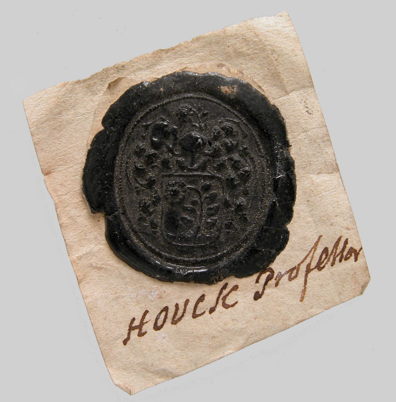
In the photograph, the dark material carries a shield, a branching motif, and the ornament above it. That does not make every represented element Sable. The colour of the material applies across the image, while a colour blazon would distinguish the field and its device. Calling the field black because the wax is black would confuse those two kinds of information. It would also leave the equally dark charge with the same supposed tincture, for no reason supplied by the record.
Now ask how you could recover the missing information. A securely identified colour witness might help. So might a written description demonstrably connected to this design and bearer. Each proposed connection requires its own evidence: an armorial with similar branches does not automatically belong to the person who used this impression. Keep the shape you can observe separate from the colour you hope to establish.
The handwritten mount presents another problem. It is a separate surface with its own inscription. A catalogue note, a collector’s annotation, and lettering actually impressed into wax should occupy different rows in your witness table. Record what is legible before deciding whose statement it is.
For a short submission, describe the visible arrangement without tinctures, quote the catalogue date as a range, and name the first source you would seek for a colour interpretation. Leave the colour fields blank until the connection can be defended. The seal evidence workshop extends this into a comparison of appearance, date, and documentary setting.
Worked problem: trace the layers
Constructed teaching blazon: Azure, on a fess Or three mullets Gules. The field is blue. The fess is gold and lies on the blue. The three red mullets lie on the gold fess. Examine each placement separately: metal on color, then color on metal. Comparing the red mullets directly to the blue field skips the intervening layer and answers the wrong question.
Now change the fess to Gules while retaining the red mullets. You have introduced two problems: the fess is a color on a color, and the mullets are the same tincture as their immediate background. The latter makes them disappear unless outlines are doing work that the specification did not solve. A decorative black outline may help a particular picture, but it does not undo the change in tincture relationships.
Next consider Per pale Argent and Azure, a roundel counterchanged. The circular charge crosses the division. Its portion on the white half takes blue; its portion on the blue half takes white. This is counterchanging, not a gradient. Trace the two portions separately. The example demonstrates why a simple “charge has one color” model cannot represent every armorial relationship. Our Atelier is a limited teaching tool, not an exhaustive implementation.
Workshop and answer discussion
Make three designs using one field, one ordinary, and one charge type. In the first, use a conventional layered contrast. In the second, create a deliberate same-category overlap. In the third, use a divided field and explain why adjacency should not be confused with superposition. Label all three as original teaching studies.
For each design, write a short layer audit: element, tincture, immediate background, and your assessment. Then reduce the image to approximately 40 pixels high and inspect it in grayscale. These are practical visual tests, not additional laws of arms. Explain what each test reveals and what it cannot determine.
What should the audit conclude?
The first design should identify each direct overlap instead of comparing every tincture to every other tincture. The second should describe the actual problem, including whether identical tinctures obscure the charge. The third should name the field division and distinguish a shared edge from a figure placed on a background. A thoughtful conclusion separates conventional heraldic contrast from modern display legibility and acknowledges that neither test establishes legal entitlement.
For a documentary extension, choose a monochrome armorial witness and report exactly how its tinctures can be known. An accompanying description, explicit tincture annotations, and a verified hatching key are stronger answers than “that family usually uses blue.”
Documentary workshop: explain the disagreement
The following exercises ask for an argument with inspectable premises. Use the linked institutional records, retain their original terminology, and identify which parts of your conclusion are direct observations and which are interpretations. The answer discussions indicate the reasoning required; they are not substitutes for consulting the witnesses.
1. Is buff a metal?
Compare the Quartermaster Corps design, the 259th Quartermaster Battalion description, and the Correctional Service of Canada badge. For each, record the named tincture immediately above Buff. Explain why a single global category does not adequately describe the observed combinations. Then specify what additional source would allow you to make a stronger claim about an institution’s policy.
Answer discussion: distinguish the combination from the classification
The Army records include blue and silver directly associated with buff grounds in different designs; the Canadian badge puts gold on its buff roundel. A two-category assignment has different implications for those relationships. The records therefore justify reporting the combinations, while a universal category requires additional evidence. An express institutional guide, design policy, or explanation from the responsible heraldic authority would strengthen the classification claim. A general web table repeating the same examples would not constitute an independent institutional rule.
The Canadian case supports a color-role inference from its gold-on-buff relationship. That is a useful conclusion provided we state how it was reached. A strong answer does not call the record invalid simply because a preliminary chart treated every pale tincture as a metal, and it does not invent a policy to rescue the chart. It revises the chart’s scope to match the evidence.
2. What does copper name?
Compare Whitehorse, Coppermine Herald, and the Nisga’a Nation record. Identify where copper supplies a tincture and where it names an object. Explain why the actual material of a photograph would be a third question. Write one catalog sentence for each record that preserves those distinctions.
Answer discussion: read the grammatical role
A successful answer separates the noun naming a figure from the term controlling its representation. It retains Argent where the source specifies it even if the named object is associated with copper. It also identifies the source of any symbolic explanation rather than supplying a general meaning for all copper-colored arms. For a physical witness, a material identification would require its own catalog or analytical evidence. It cannot be recovered merely by converting a color term into the name of a substance.
3. When does normalization lose information?
Take the expanded palette in the Canada Pride Citation record. Make a transcription column retaining its terms and a separate search-label column using everyday descriptions. Identify which distinctions would disappear if the search labels replaced the transcription. Then repeat the exercise with the Butchart Gardens description, distinguishing a named tincture from a plant described proper.
Answer discussion: retain both levels of the record
Normalization helps readers search, but a many-to-one mapping can collapse terms the source distinguishes. Keep the original vocabulary available so the interpretation can be audited. A strong answer also distinguishes an English explanatory gloss from a purported translation of an entire blazon. In the plant example, identifying a broad hue does not preserve the instruction concerning natural coloration or the named species. The search interface and the documentary edition have different jobs.
4. Can the wax tell us the colors?
Return to the Met impression. Prepare three short paragraphs: a visible description of the shield, an account of what the catalog establishes about the object, and a plan for finding a securely connected color witness. Mark every proposed identification or restoration as a proposal. Explain what would make the next witness relevant to this impression rather than merely similar to it.
Answer discussion: make the connection carry the claim
The material’s darkness does not divide the design into heraldic tinctures. A convincing next step needs a connection among witness, design, bearer, and date. A similar motif can guide the search while leaving that connection unresolved. The separate paper mount should remain a separate witness whose authorship and date require investigation. The broad catalog range cannot become a precise medieval date simply because that date would fit the proposed identification.
5. Does the color word identify the pigment?
Use the South African registration notice and its explanatory account. Separate the specified color vocabulary from the iconographic connection and from the material composition of any particular reproduction. Write the strongest conclusion each source allows, then identify the evidence needed for a claim about the reproduction’s pigments.
Answer discussion: follow three different evidence trails
The formal description establishes vocabulary for the design. The explanatory account supplies an attributed iconographic interpretation. Neither performs material analysis of the copy you have chosen. For that final claim, seek a production record, conservation study, or an appropriately documented examination of the physical object. Do not let a familiar pigment name substitute for evidence that the substance is present.
Research project: a history of one unusual tincture
Choose a term whose practice interests you and define a question narrow enough to answer. For example, investigate named uses of Buff in a specified group of Army armorial records, or compare the role of Copper in a selected set of Canadian grants. Identify the institution, period, and emblem types at the outset. If the corpus combines arms, badges, and uniform instructions, retain those types as separate fields so their differences remain available for analysis.
Build a witness inventory before writing the history. For each entry, retain its title or recipient, date, formal act if one is stated, volume or accession reference, source URL, original term, relevant part of the description, and any explicit symbolic explanation. Add separate columns for direct evidence, interpretation, and unresolved questions. A searchable online register is an access point; record what you actually consulted and whether the underlying grant or illustrated witness was inspected.
Then select contrasting cases that force you to refine the explanation. A series of similar blue-on-buff designs can establish repeated use in the selected group, but a silver-on-buff example tests whether your proposed category explains the whole group. A term naming an object rather than a tincture tests the search method. A catalog translation tests whether you are counting original vocabulary or an editor’s choices. These are useful difficulties because they expose assumptions the easy matches leave invisible.
If you make a frequency claim, give its denominator. “Four examples” says little without knowing whether you searched twenty records, two thousand, or the first page of results. Report the scope, search vocabulary, exclusions, and unresolved cases alongside the count. A conclusion about the selected corpus can be defensible even when the material does not support a conclusion about all Canadian or European heraldry. Stating the boundary makes the result usable by the next researcher.
Your final study should explain a development, not merely display a collection of swatches. Show what the term enables an institution or bearer to distinguish, how it relates to the surrounding design vocabulary, and which evidence supports that account. Include an original comparative diagram or a rights-cleared image only when it advances the argument. A reader should be able to follow your record trail and identify where a different interpretation could reasonably enter.
The object comparison notebook supports notes on a chosen pair of objects, while the source atlas and regional studies supply routes into wider contexts. Keep the larger corpus inventory and claim ledger in your own research file. The next step is to expand the relevant national history until its institutional and artistic differences are intelligible. There is no requirement that every country’s chapter occupy the same amount of space.
Reading the sources as different kinds of evidence
The source notes below distinguish several genres deliberately. An educational FAQ introduces an institution’s present vocabulary. A register entry records a dated emblem and its description. A military museum page supplies an institutional historical account that can lead us toward an approval record. A formal registration notice identifies an official act and its published vocabulary. An object catalog records material and attribution. A historical manual documents an author’s synthesis and argument at a particular time.
Those genres answer different questions. To investigate an armorial term’s formal use, begin with the grant, registration, or institutional description. To investigate the realization, inspect the relevant drawing or object. To investigate an author’s theory, read the manual in its historical setting. Where the account matters enough to support a disputed conclusion, follow the derivative catalog or historical page toward the underlying witness and compare it with other evidence. The strength of the final claim depends on that connection, rather than on the number of links in its bibliography.
Fox-Davies remains useful here as a dated participant in the argument, particularly when he challenges received stories about stains. The modern cases supply evidence beyond his period and institutional frame. A reference work should bring those records into conversation through an explanation readers can test. The palette becomes a way into the history of heraldry: who defines its terms, what a design must preserve, and how a representation carries information across materials, languages, and generations.
Footnotes
-
National Records of Scotland, Coat of Arms, “Terminology”, tincture table; consulted 8 October 2026. Institutional terminology guide. ↩
-
Governor General of Canada, Frequently Asked Questions, question 10. Present Canadian formulation; consulted 8 October 2026. ↩ ↩2
-
College of Arms, Newsletter no. 18, “FAQs: heraldry”, answer about Pantone numbers and recognizable shades. Institutional guidance; indexed text consulted 10 October 2026. The PDF endpoint was intermittently unavailable during this pass. ↩
-
Department of National Defence, The Heritage Structure of the Canadian Armed Forces, chapter 6, section 3, definition 6, conceptual colors and variation in shades. English institutional terminology; consulted 10 October 2026. ↩
-
U.S. Army Combined Arms Support Command, LG Proponent History, “Branch Colors”, separate cloth, yarn, and PMS identifiers for Soldier Red and Bronze. Official branch page dated 4 May 2021; consulted 10 October 2026. Production identifiers are specific to this application. ↩
-
Fox-Davies, A Complete Guide to Heraldry (1909), chapter VII, pp. 67–98, text. Historical discussion; use with its date and British frame in view. ↩ ↩2
-
U.S. Army Quartermaster Corps and School, Flags & Crests of the Quartermaster: History, regimental arms and 16 June 1994 approval; school arms with an Argent-edged Azure bend. Indexed institutional text consulted 10 October 2026; direct access was intermittently unavailable. The page identifies its Institute of Heraldry sources; their approval files have not been independently examined here. ↩ ↩2
-
U.S. Army Quartermaster School, Officer Personnel Development — Branch Information, buff and blue branch colors and tan description. Institutional account; indexed text consulted 10 October 2026. ↩
-
Royal Armouries, Buff Coat (III.1929), dating and oil-tanned bovine leather. Object account; consulted 10 October 2026. No photograph from this page is reproduced here. ↩
-
National Army Museum, The Buffs (Royal East Kent Regiment), buff coats, nickname, and uniform facings. Museum regimental history; consulted 10 October 2026. Evidence for material and uniform usage, not an armorial-tincture frequency survey. ↩
-
U.S. Army Quartermaster Museum, Quartermaster Corps Regimental Coat of Arms, attribution of approval to the Institute of Heraldry and stated symbolism of buff and blue. Indexed museum text consulted 10 October 2026; the approval instrument itself remains to be inspected. ↩
-
U.S. Army Quartermaster Museum, 259th Quartermaster Battalion, “Coat of Arms”, shield description and approval date of 29 September 1942. Museum page last updated 21 October 2025; consulted 10 October 2026. The page separately dates the distinctive unit insignia to 12 September 1942; the chapter uses the coat-of-arms date. ↩
-
Canadian Heraldic Authority, Correctional Service of Canada, grant of a badge and flag, 15 October 2009, Public Register vol. V, p. 471. Badge description supplies Buff and the superposed tinctures. English register text consulted 10 October 2026. The color-role assessment is this chapter’s compositional inference, not an explicit policy statement in the entry. The emblem image is linked through the record, not reproduced. ↩
-
Canadian Heraldic Authority, The City of Whitehorse, grant of arms and supporters, 15 November 2002, vol. IV, p. 253. English blazon and attributed symbolism; consulted 10 October 2026. The additional-metal interpretation follows the specified Copper/Azure relationship; the entry calls the material invoked in the symbolism a metal. No register artwork reproduced. ↩ ↩2
-
Canadian Heraldic Authority, Coppermine Herald, Canadian Heraldic Authority, badge of office, description and symbolism. English register text; consulted 10 October 2026. ↩
-
Canadian Heraldic Authority, Nisga’a Nation, Hayatskw emblem, description and attributed symbolism. English register text; consulted 10 October 2026. The comparison concerns the word’s grammatical role and does not equate all Indigenous emblem systems with European armory. ↩
-
Canadian Heraldic Authority, Canada Pride Citation, registration of an insignia and a badge, 20 December 2018, vol. VII, p. 129. English descriptions and the register’s eight-color symbolic account; consulted 10 October 2026. No emblem artwork reproduced. ↩ ↩2
-
Canadian Heraldic Authority, The Butchart Gardens Limited, grant of arms, supporters, and badge, 21 November 1994, vol. II, p. 376. English description distinguishes Bleu-Celeste from named flowers proper; consulted 10 October 2026. ↩
-
Bureau of Heraldry, South Africa, Government Gazette vol. 418, no. 21131, 28 April 2000, General Notice 425, text and one-page text reproduction, hosted by Creamer Media. English primary registration notice in a third-party reproduction; consulted 10 October 2026. The available reproduction contains apparent textual errors and an encoding loss; this chapter does not claim a verified full transcription of the original Gazette page. ↩
-
South African Government, National Coat of Arms, “The human figures”, connection to the Linton stone and the official interpretation of greeting and unity. English government explanatory account; consulted 10 October 2026. ↩
-
English Heritage, A beginner’s guide to heraldry, “The Colours of Heraldry”; Fox-Davies, chapter VII. Consulted 8 October 2026. ↩
-
University of Notre Dame, Rare Books & Special Collections, Heraldic Dictionary: Tincture — Metals, Colors & Furs, hatching key and named fur patterns. Curatorial reference for reading collection material; consulted 10 October 2026. The key is a conventional interpretive aid, not evidence that every monochrome witness uses it. ↩ ↩2
-
Fox-Davies, chapter VII, discussion of proper; compare Canadian Heraldic Authority FAQ, question 10, for a contemporary formulation. ↩
-
Fox-Davies, chapters VII–VIII, pp. 67–105. Hatching and tricking are historical conventions whose applicability must be established for the witness. ↩
-
PAN Biblioteka Kórnicka / Wielkopolska Digital Library, catalog record for Silvestro Pietrasanta, Tesserae gentilitiae, Rome, 1638, Latin, shelfmark 310308. Catalog consulted 10 October 2026. Bibliographic lead only: the complete scanned volume and its plates have not been collated in this chapter. ↩
-
The Metropolitan Museum of Art, Seal Impression, Coat of Arms, 1981.534.7, date, culture, medium, and photograph; consulted 9 October 2026. Catalogue-mediated study, not a new bearer identification. ↩
Read beyond this lesson.
Follow these sources when you want to examine the underlying rule or argument. Note the place, period, and institution each source describes before applying it elsewhere.
- College of Arms — Tincture FAQ ↗ — On the absence of fixed colour shades.
- The Heraldry Society — Heraldry for Beginners ↗ — A clear chart of historical heraldic hatching conventions.
- Canadian Heraldic Authority — Correctional Service of Canada ↗ — Dated grant using Buff in a badge; inspect the superposed tinctures before proposing a category.
- Canadian Heraldic Authority — City of Whitehorse ↗ — Copper in a dated grant, with an attributed explanation of its local significance.
- U.S. Army Quartermaster Museum — 259th Quartermaster Battalion ↗ — Institutional description documenting Argent charges on a Buff field.